Matchli
Matchli
Matchli
Connecting rental fit, application readiness and the next step in one experience.
Connecting rental fit, application readiness and the next step in one experience.
← Back


A Zürich rental platform that matches homes to your requirements and keeps your rental profile ready to send.
RoleFull stack design engineer
ScopeBrand to backend
Design
BrandingDesign system
ProductWebsiteWeb appNative app
EngineeringFrontendBackend
Stage3 of 5
Concept
Design
Prototype
Beta
Live
Designs complete, prototype running locally.
CompanyMatchli.ch
Year2026
ToolsFigma, Codex, Claude, Flutter
A Zürich rental platform that matches homes to your requirements and keeps your rental profile ready to send.
RoleFull stack design engineer
ScopeBrand to backend
Design
BrandingDesign system
ProductWebsiteWeb appNative app
EngineeringFrontendBackend
Stage3 of 5
Concept
Design
Prototype
Beta
Live
Designs complete, prototype running locally.
CompanyMatchli.ch
Year2026
ToolsFigma, Codex, Claude, Flutter
Making the rental decision easier to understand.
Making the rental decision easier to understand.
Matchli explores a fragmented rental decision: whether a home fits, what supports that match and what the tenant needs to do next. I defined the product structure, directed AI-assisted explorations and reviewed each output against those questions.
Matchli explores a fragmented rental decision: whether a home fits, what supports that match and what the tenant needs to do next. I defined the product structure, directed AI-assisted explorations and reviewed each output against those questions.
Connecting the home, its fit and the applicant’s readiness
The experience needed to connect three things usually shown apart: the home, the reasons it fits and the applicant’s readiness to act.
The experience needed to connect three things usually shown apart: the home, the reasons it fits and the applicant’s readiness to act.
My contribution
My contribution
I designed the search, listing and rental profile journeys, set the visual direction and turned accepted patterns into reusable components. I defined how fit, property information and application readiness should connect, including the requirements controls, match explanations, document states and rental profile sharing steps.
I designed the search, listing and rental profile journeys, set the visual direction and turned accepted patterns into reusable components. I defined how fit, property information and application readiness should connect, including the requirements controls, match explanations, document states and rental profile sharing steps.
As the independent designer and builder, I documented the brand and component system in Figma and carried the journeys into web and SwiftUI prototypes. I directed AI-assisted exploration and implementation, checked the hierarchy and interactions, and decided which patterns to retain. The work shown here consists of designs and local prototypes.
As the independent designer and builder, I documented the brand and component system in Figma and carried the journeys into web and SwiftUI prototypes. I directed AI-assisted exploration and implementation, checked the hierarchy and interactions, and decided which patterns to retain. The work shown here consists of designs and local prototypes.
As the independent designer and builder, I documented the brand and component system in Figma and carried the journeys into web and SwiftUI prototypes. I directed AI-assisted exploration and implementation, checked the hierarchy and interactions, and decided which patterns to retain. The work shown here consists of designs and local prototypes.

01 / Property card
Making the property card easier to read and use
Making the property card easier to read and use
I reviewed the first AI-generated property card to understand what someone would notice first and which parts looked clickable. That review helped me clarify the information hierarchy and distinguish opening the listing, viewing price details and saving a home.
I reviewed the first AI-generated property card to understand what someone would notice first and which parts looked clickable. That review helped me clarify the information hierarchy and distinguish opening the listing, viewing price details and saving a home.
Competing information and unclear actions
The title, rent and match score compete for attention. Requirements and the rent warning sit alongside property facts. The arrow suggests opening the listing, but it is unclear whether the arrow or the whole card is clickable.
A clearer hierarchy and separate actions
I used one text size, with weight distinguishing the title, rent and match score from supporting details. The rent warning has its own badge. In the reviewed design, the card opens the listing, the underlined rent opens price details, and the save button is separate.
02 / Match reasons
Keeping match reasons and missing documents visible
Keeping match reasons and missing documents visible
The first listing split fit, requirements and readiness across separate tabs. I kept the image-led structure, brought the match reasons and missing documents into one visible sequence, and placed the next action beside rental profile state.
The first listing split fit, requirements and readiness across separate tabs. I kept the image-led structure, brought the match reasons and missing documents into one visible sequence, and placed the next action beside rental profile state.


03 / Application
Carrying the decision through to a prepared application
Carrying the decision through to a prepared application
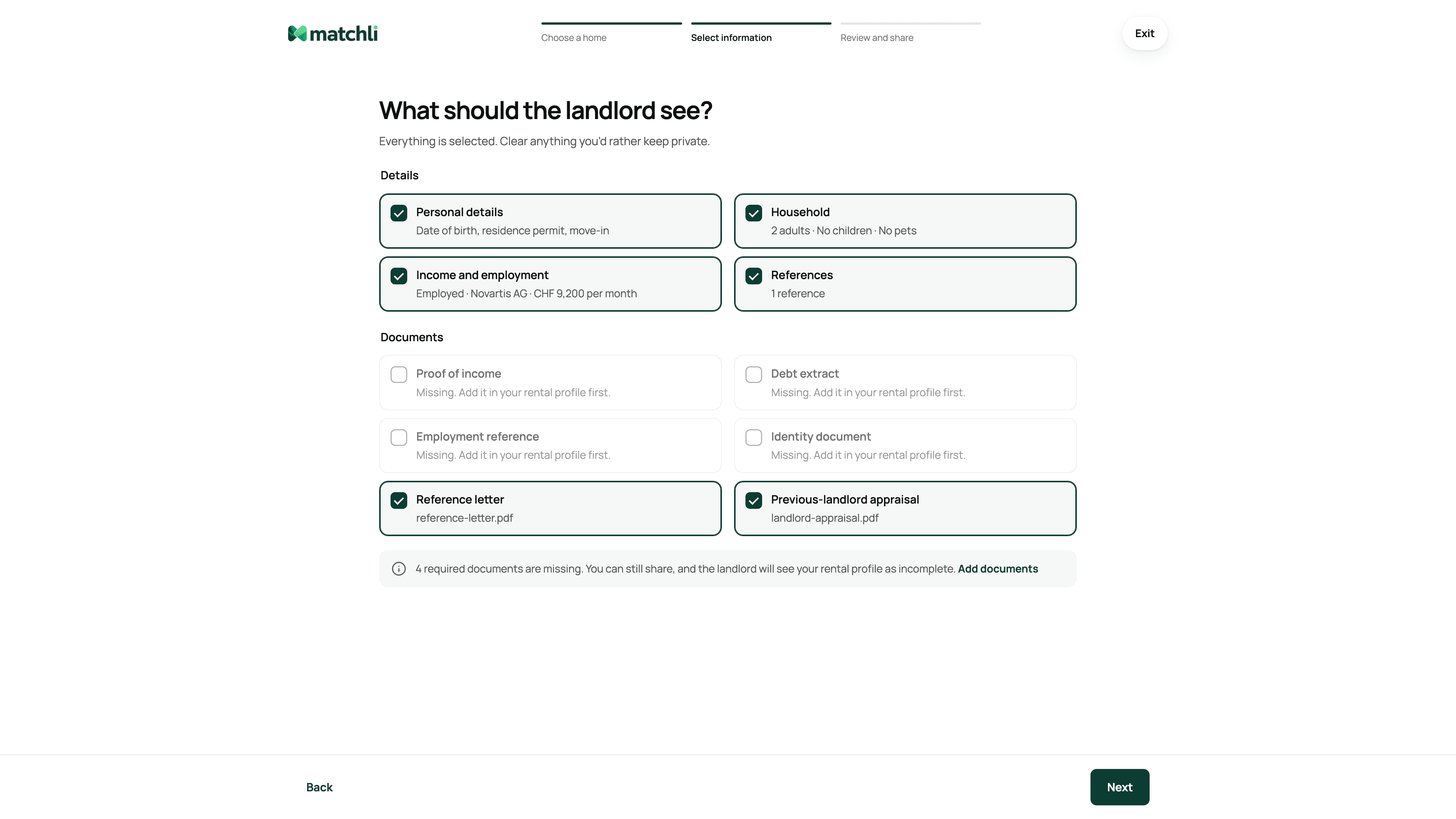
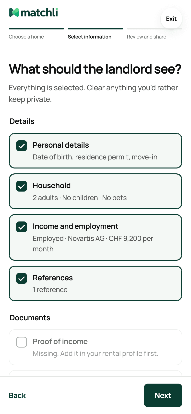
The rental profile extends the listing decision into application preparation. I designed saved and missing document states, a review step and a three-step sharing flow. The prototype checks files locally in the browser and does not upload them.
The rental profile extends the listing decision into application preparation. I designed saved and missing document states, a review step and a three-step sharing flow. The prototype checks files locally in the browser and does not upload them.
Review before sharing
The prototype separates choosing a home, selecting information and reviewing the share.
The prototype separates choosing a home, selecting information and reviewing the share.
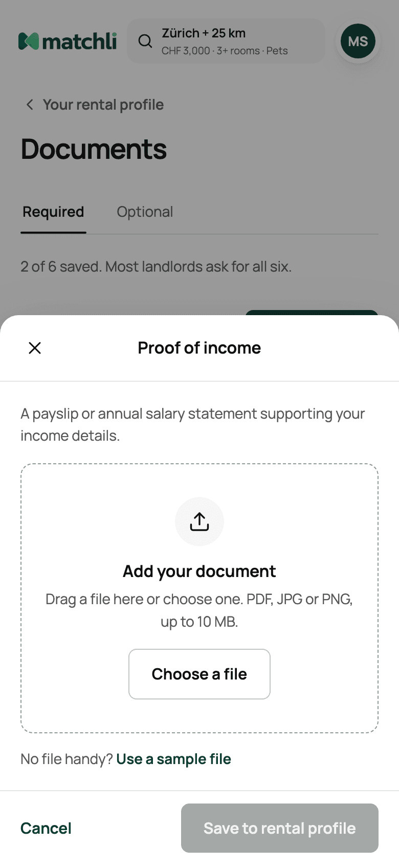
Making local file handling clear
Files are checked locally in the browser.
Files are checked locally in the browser.



Keeping search, listings and rental profiles consistent
Keeping search, listings and rental profiles consistent
I built and documented Matchli’s brand foundations, including the Manrope typeface, responsive components and screen patterns in Figma. The system gives search, listing and rental profile one visual language. The button family below is one example from the tenant web prototype.
I built and documented Matchli’s brand foundations, including the Manrope typeface, responsive components and screen patterns in Figma. The system gives search, listing and rental profile one visual language. The button family below is one example from the tenant web prototype.


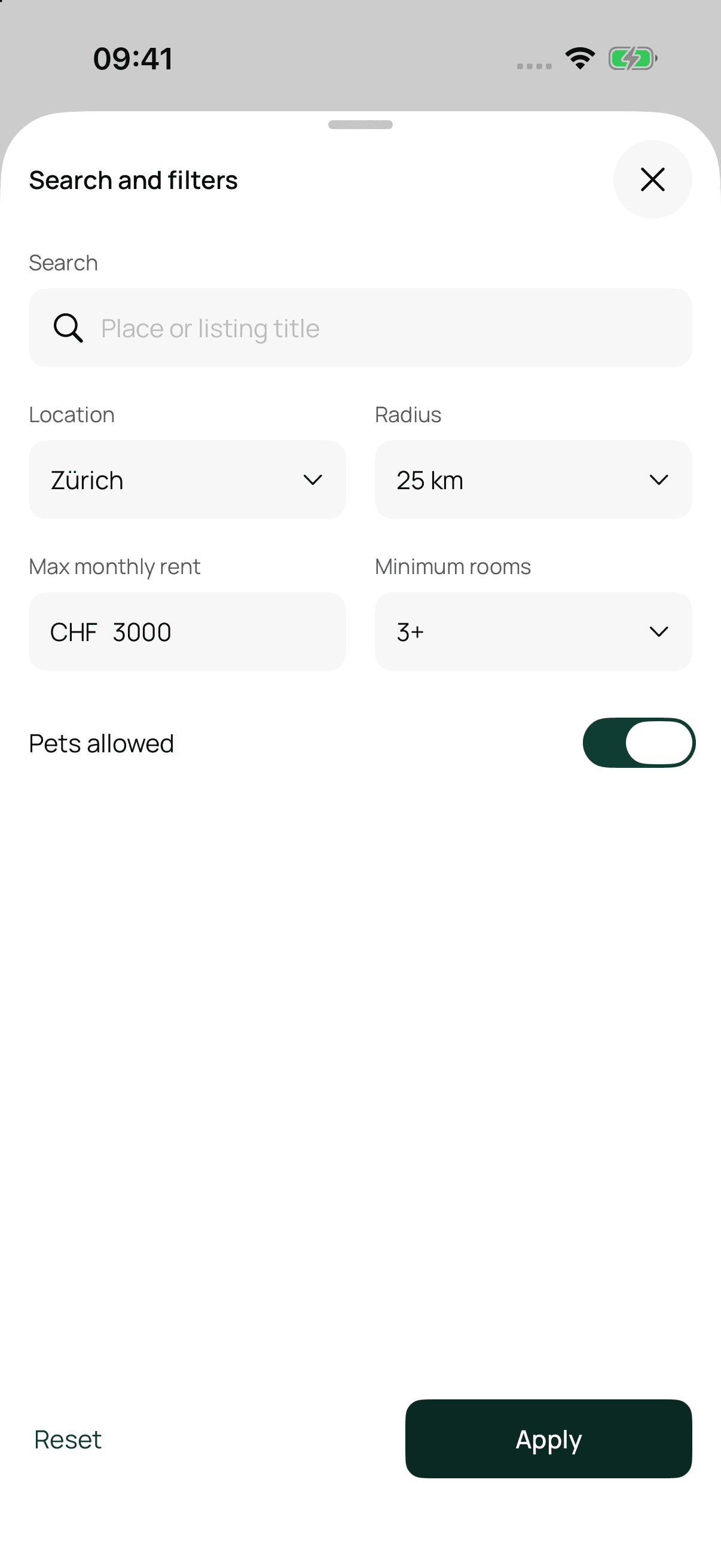
Testing the journeys in working prototypes
Testing the journeys in working prototypes
SwiftUI prototype · sample property data

More work
Other case studies.
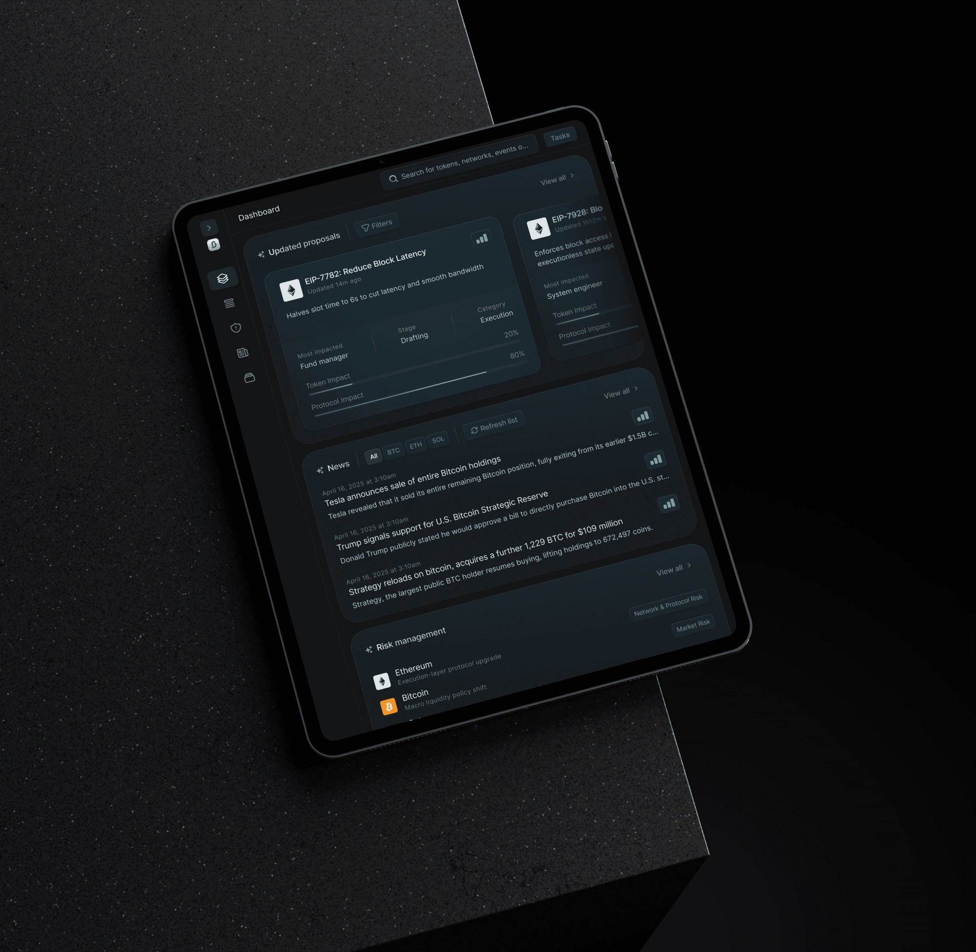
AI product · 2025
21Shares BlockSensai
Crypto governance and news intelligence for institutional teams.
Crypto intelligence for institutional teams.
View case studyView→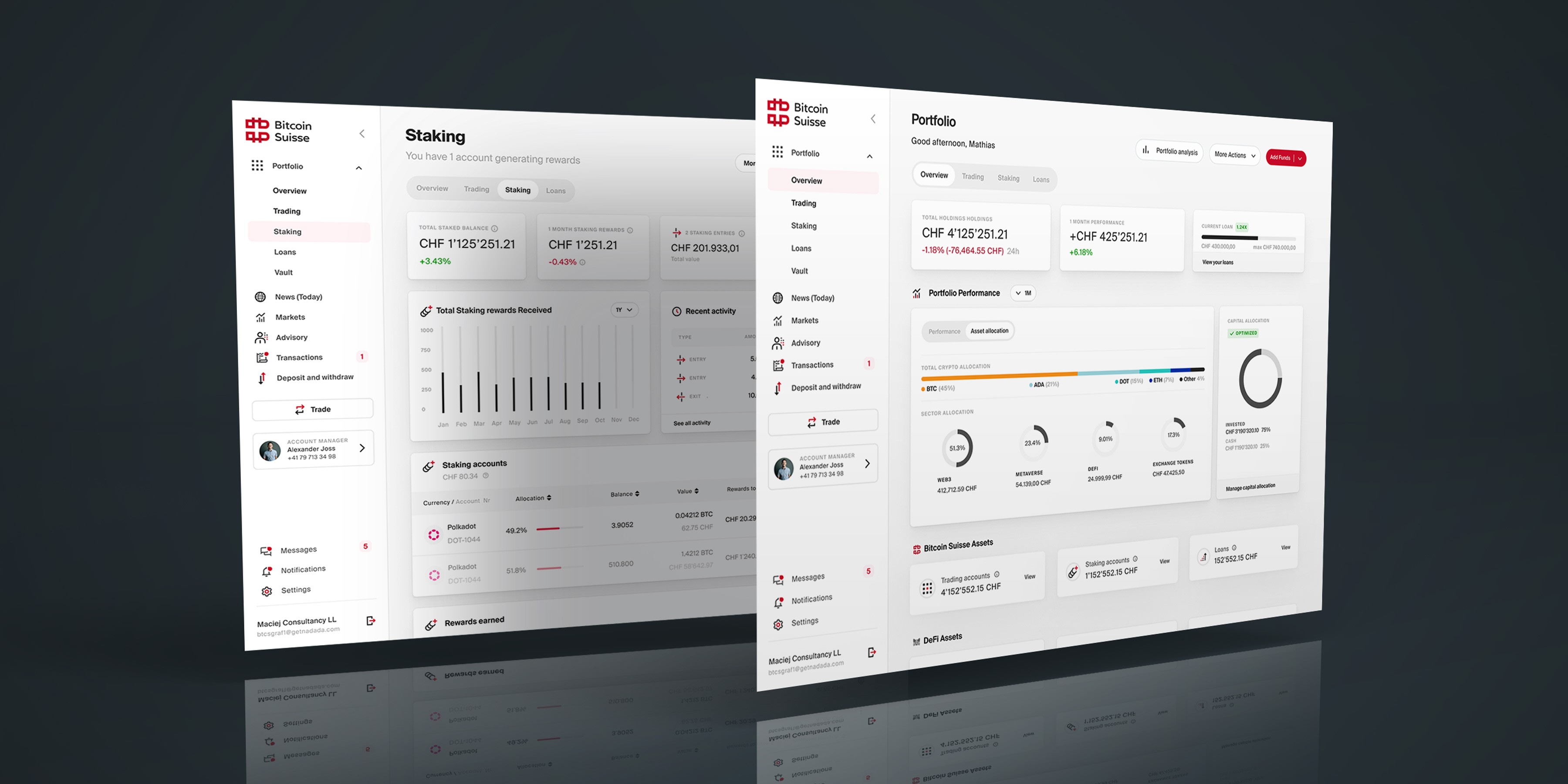
Portfolio redesign · 2023
Bitcoin Suisse
A unified model for holdings, accounts, performance and liabilities.
A unified model for holdings, accounts and performance.
View case studyView→
Investment platform · 2020–21
Credit Suisse
Responsive investment journeys backed by a better design and engineering delivery process.
Responsive journeys and a better delivery process.
View case studyView→