Credit Suisse Investment Platform
Credit Suisse Investment Platform
Credit Suisse Investment Platform
Making complex investment journeys easier to follow, while bringing design and engineering together to close release-critical gaps.
Making complex investment journeys easier to follow, while bringing design and engineering together to close release-critical gaps.
← Back

An investment platform for clients and relationship managers to review portfolios, make payments and configure mandates across web and iOS.
The team shipped the portfolio, payment and mandate work and closed high-priority implementation defects before launch.
An investment platform with product and delivery challenges
An investment platform with product and delivery challenges
Credit Suisse’s Investment Platform connected portfolio reviews, payments and mandate configuration for clients and relationship managers across responsive web and native iOS. Complex financial rules and dense information made it important to explain the relationships between a choice, its constraints and its consequences.
I joined midway through the redesign, when requirements and implementation gaps were still surfacing. Alongside designing the platform, I brought design, project management and engineering into direct collaboration. Our team shipped the portfolio, payment and mandate work and closed high-priority defects before launch. The project team estimated that avoiding another development and testing cycle saved more than CHF 100k.
Credit Suisse’s Investment Platform connected portfolio reviews, payments and mandate configuration for clients and relationship managers across responsive web and native iOS. Complex financial rules and dense information made it important to explain the relationships between a choice, its constraints and its consequences.
I joined midway through the redesign, when requirements and implementation gaps were still surfacing. Alongside designing the platform, I brought design, project management and engineering into direct collaboration. Our team shipped the portfolio, payment and mandate work and closed high-priority defects before launch. The project team estimated that avoiding another development and testing cycle saved more than CHF 100k.
My contribution
My contribution
As Senior Product Designer, I designed portfolio, payment and mandate journeys for clients and relationship managers across responsive web and native iOS. I later coordinated six designers as interim Design Lead while continuing hands-on design, with responsibility for prioritisation, research scoping with UX Research, and implementation reviews with project management and engineering. Alongside the design work, I ran Scrum ceremonies and design reviews, and helped plan the team’s work around delivery milestones and the launch.
As Senior Product Designer, I designed portfolio, payment and mandate journeys for clients and relationship managers across responsive web and native iOS. I later coordinated six designers as interim Design Lead while continuing hands-on design, with responsibility for prioritisation, research scoping with UX Research, and implementation reviews with project management and engineering. Alongside the design work, I ran Scrum ceremonies and design reviews, and helped plan the team’s work around delivery milestones and the launch.
01 / Investment decisions
Making complex investment decisions understandable
Making complex investment decisions understandable
Mandate and payment journeys depended on financial rules, account context and information that users needed to understand together. I worked with analysts and process experts to map those relationships before defining the screens. With UX Research, I scoped qualitative questions, card sorting, quantitative questions and prototype tasks for repeated two-day InVision rounds with five users per day. I used the findings to refine the client and relationship-manager journeys, screen requirements and shared components as the design developed.
Mandate and payment journeys depended on financial rules, account context and information that users needed to understand together. I worked with analysts and process experts to map those relationships before defining the screens. With UX Research, I scoped qualitative questions, card sorting, quantitative questions and prototype tasks for repeated two-day InVision rounds with five users per day. I used the findings to refine the client and relationship-manager journeys, screen requirements and shared components as the design developed.


Keeping the same rules across web and native iOS
Keeping the same rules across web and native iOS
The same journey needed to remain understandable when it moved from a desktop overview to a smaller screen. Alongside the responsive web platform, we designed a native iOS app. I defined what each screen needed to show, which financial rules applied and how its information adapted across breakpoints. This gave the team a shared structure to reuse across the application while keeping the purpose of each screen clear.
The same journey needed to remain understandable when it moved from a desktop overview to a smaller screen. Alongside the responsive web platform, we designed a native iOS app. I defined what each screen needed to show, which financial rules applied and how its information adapted across breakpoints. This gave the team a shared structure to reuse across the application while keeping the purpose of each screen clear.


Structuring choices around their consequences
Structuring choices around their consequences
Mandate and payment flows combined primary decisions with optional settings and supporting detail. Giving every choice the same prominence would have made the main task harder to follow. I separated the primary choices from secondary options and structured the screens around the relationships between them, keeping the current decision and the information needed to make it together.
Mandate and payment flows combined primary decisions with optional settings and supporting detail. Giving every choice the same prominence would have made the main task harder to follow. I separated the primary choices from secondary options and structured the screens around the relationships between them, keeping the current decision and the information needed to make it together.
Connecting investment choices with the proposal
Connecting investment choices with the proposal
For mandates, I grouped related settings into clearly labelled sections and used selection cards to support comparison. The strategy configuration sat beside a projection and proposal summary, bringing the inputs and their financial implications into the same view. Headings, spacing and consistent alignment gave the page a clear reading order and helped users distinguish between choices, supporting information and calculated results.
For mandates, I grouped related settings into clearly labelled sections and used selection cards to support comparison. The strategy configuration sat beside a projection and proposal summary, bringing the inputs and their financial implications into the same view. Headings, spacing and consistent alignment gave the page a clear reading order and helped users distinguish between choices, supporting information and calculated results.


Supporting payment review and authorisation
Supporting payment review and authorisation
On mobile, the payment flow introduced information in stages, then brought the relevant details together for review. Optional settings remained available without competing with the main task. Review, authorisation and confirmation each had a distinct purpose: checking the instruction, approving it deliberately, and understanding its status afterwards.
On mobile, the payment flow introduced information in stages, then brought the relevant details together for review. Optional settings remained available without competing with the main task. Review, authorisation and confirmation each had a distinct purpose: checking the instruction, approving it deliberately, and understanding its status afterwards.

02 / Shared patterns
Supporting clients and relationship managers consistently
Supporting clients and relationship managers consistently
Clients needed to understand their holdings and performance, while relationship managers needed to configure and review investment proposals. The design system had to support both without making either workflow carry the full complexity of the other. I reshaped its core patterns through my work on portfolio, payment and mobile views, grouping related financial information and giving each page a clearer hierarchy. I brought key information above the fold and kept components and flows consistent while preserving the depth of detail each task required.
Clients needed to understand their holdings and performance, while relationship managers needed to configure and review investment proposals. The design system had to support both without making either workflow carry the full complexity of the other. I reshaped its core patterns through my work on portfolio, payment and mobile views, grouping related financial information and giving each page a clearer hierarchy. I brought key information above the fold and kept components and flows consistent while preserving the depth of detail each task required.

Old design
Old design


New design
New design
Adapting shared patterns to each task
Adapting shared patterns to each task
I built out the design system and component library across client and relationship-manager products. In portfolio tables, asset groups and aligned amounts made holdings easier to scan. In relationship-manager views, adjacent columns kept existing and recommended strategies visible for comparison. On mobile, dense rows became compact records, with transaction details available in a dedicated sheet.
These views shared patterns for summaries, charts and navigation, while retaining the controls and level of detail each task needed. Our prototypes stayed close to the final interface, so research feedback could move into the product without being translated through a separate visual layer for each channel.
I built out the design system and component library across client and relationship-manager products. In portfolio tables, asset groups and aligned amounts made holdings easier to scan. In relationship-manager views, adjacent columns kept existing and recommended strategies visible for comparison. On mobile, dense rows became compact records, with transaction details available in a dedicated sheet.
These views shared patterns for summaries, charts and navigation, while retaining the controls and level of detail each task needed. Our prototypes stayed close to the final interface, so research feedback could move into the product without being translated through a separate visual layer for each channel.


Drag to compare, or select a view to see the complete screen.
03 / Delivery
Closing release-critical implementation gaps
Closing release-critical implementation gaps
When I joined, designers and developers did not have direct contact and were even discouraged from working together. Because of that, defects and gaps often only surfaced during QA, putting pressure on the teams. I brought design, project management and engineering into direct reviews and used a process map to keep requirements, decisions and exceptions visible. During the 12-week QA and hypercare period, we reviewed implementation gaps together and prioritised defects that could block client and relationship-manager journeys before launch.
When I joined, designers and developers did not have direct contact and were even discouraged from working together. Because of that, defects and gaps often only surfaced during QA, putting pressure on the teams. I brought design, project management and engineering into direct reviews and used a process map to keep requirements, decisions and exceptions visible. During the 12-week QA and hypercare period, we reviewed implementation gaps together and prioritised defects that could block client and relationship-manager journeys before launch.
My process work also extended across the wider 50-person project team. I coordinated the design roadmap and QA plan with project management and engineering, helping the teams work through implementation issues against the remaining milestones and launch deadline. Shared reviews gave us a place to agree priorities and resolve questions together, while I continued guiding the quality of the designs and their implementation.


Leading the design team and organising delivery
Leading the design team and organising delivery
I was asked to take on the interim Design Lead role during a reorganisation of the leadership team. I coordinated six designers, handled stakeholder requests and prioritisation, and supported colleagues in their day-to-day work. I ran sprint planning, stand-ups, retrospectives and stakeholder reviews, and established regular design reviews. Speaking with each designer helped me understand where they needed support and which requirements or implementation questions needed to be resolved together. I used planning and reviews to agree priorities with the team, clarify who was taking work forward and keep progress aligned with the next milestone.
I continued designing the platform throughout that period, including portfolio, payment and mandate journeys, hedging, leverage and proposal-adjustment tools. With UX Research, I scoped the test questions and activities, then worked with project management and engineering to review the implementation. That kept my coordination work connected to the product decisions and delivery issues the team was facing.
I was asked to take on the interim Design Lead role during a reorganisation of the leadership team. I coordinated six designers, handled stakeholder requests and prioritisation, and supported colleagues in their day-to-day work. I ran sprint planning, stand-ups, retrospectives and stakeholder reviews, and established regular design reviews. Speaking with each designer helped me understand where they needed support and which requirements or implementation questions needed to be resolved together. I used planning and reviews to agree priorities with the team, clarify who was taking work forward and keep progress aligned with the next milestone.
I continued designing the platform throughout that period, including portfolio, payment and mandate journeys, hedging, leverage and proposal-adjustment tools. With UX Research, I scoped the test questions and activities, then worked with project management and engineering to review the implementation. That kept my coordination work connected to the product decisions and delivery issues the team was facing.

The team shipped the work and closed the critical gaps
The team shipped the work and closed the critical gaps
Our team shipped the portfolio, payment and mandate work and closed the high-priority implementation defects before launch. I contributed through hands-on platform design, coordination of six designers and shared implementation reviews with project management and engineering. The project team estimated more than CHF 100k in avoided cost from preventing another development and testing cycle.
Our team shipped the portfolio, payment and mandate work and closed the high-priority implementation defects before launch. I contributed through hands-on platform design, coordination of six designers and shared implementation reviews with project management and engineering. The project team estimated more than CHF 100k in avoided cost from preventing another development and testing cycle.
6
6
designers
Led as interim design lead. I coordinated the team while continuing my own hands-on work on the platform.
Led as interim design lead. I coordinated the team while continuing my own hands-on work on the platform.
12
12
weeks
Of shared QA and hypercare. Design, project management and engineering reviewed requirements and implementation gaps together.
Of shared QA and hypercare. Design, project management and engineering reviewed requirements and implementation gaps together.
CHF
100k+
100k+
Estimated avoided cost. The project team attributed the saving to preventing another development and testing cycle.
Estimated avoided cost. The project team attributed the saving to preventing another development and testing cycle.
An investment platform with product and delivery challenges
Credit Suisse’s Investment Platform connected portfolio reviews, payments and mandate configuration for clients and relationship managers across responsive web and native iOS. Complex financial rules and dense information made it important to explain the relationships between a choice, its constraints and its consequences.
I joined midway through the redesign, when requirements and implementation gaps were still surfacing. Alongside designing the platform, I brought design, project management and engineering into direct collaboration. Our team shipped the portfolio, payment and mandate work and closed high-priority defects before launch. The project team estimated that avoiding another development and testing cycle saved more than CHF 100k.
My contribution
As Senior Product Designer, I designed portfolio, payment and mandate journeys for clients and relationship managers across responsive web and native iOS. I later coordinated six designers as interim Design Lead while continuing hands-on design, with responsibility for prioritisation, research scoping with UX Research, and implementation reviews with project management and engineering. Alongside the design work, I ran Scrum ceremonies and design reviews, and helped plan the team’s work around delivery milestones and the launch.
My hands-on work also covered hedging, leverage and proposal adjustment. The wider project team included seven design roles, three analysts and UX Research.
1. Making complex investment decisions understandable
Mandate and payment journeys depended on financial rules, account context and information that users needed to understand together. I worked with analysts and process experts to map those relationships before defining the screens. With UX Research, I scoped qualitative questions, card sorting, quantitative questions and prototype tasks for repeated two-day InVision rounds with five users per day. I used the findings to refine the client and relationship-manager journeys, screen requirements and shared components as the design developed.
The same journey needed to remain understandable when it moved from a desktop overview to a smaller screen. Alongside the responsive web platform, we designed a native iOS app. I defined what each screen needed to show, which financial rules applied and how its information adapted across breakpoints. This gave the team a shared structure to reuse across the application while keeping the purpose of each screen clear.
I mapped the client and relationship-manager journeys alongside mandate constraints, payment steps, portfolio data and responsive requirements. Keeping data dependencies attached to each step helped the team understand why a screen was needed, and other projects in the platform reused the same structure. The responsive work covered 375, 768, 1024 and 1440-pixel widths.
Structuring choices around their consequences
Mandate and payment flows combined primary decisions with optional settings and supporting detail. Giving every choice the same prominence would have made the main task harder to follow. I separated the primary choices from secondary options and structured the screens around the relationships between them, keeping the current decision and the information needed to make it together.
For mandates, I grouped related settings into clearly labelled sections and used selection cards to support comparison. The strategy configuration sat beside a projection and proposal summary, bringing the inputs and their financial implications into the same view. Headings, spacing and consistent alignment gave the page a clear reading order and helped users distinguish between choices, supporting information and calculated results.
On mobile, the payment flow introduced information in stages, then brought the relevant details together for review. Optional settings remained available without competing with the main task. Review, authorisation and confirmation each had a distinct purpose: checking the instruction, approving it deliberately, and understanding its status afterwards.
2. Supporting clients and relationship managers consistently
Clients needed to understand their holdings and performance, while relationship managers needed to configure and review investment proposals. The design system had to support both without making either workflow carry the full complexity of the other. I reshaped its core patterns through my work on portfolio, payment and mobile views, grouping related financial information and giving each page a clearer hierarchy. I brought key information above the fold and kept components and flows consistent while preserving the depth of detail each task required.
I built out the design system and component library across client and relationship-manager products. In portfolio tables, asset groups and aligned amounts made holdings easier to scan. In relationship-manager views, adjacent columns kept existing and recommended strategies visible for comparison. On mobile, dense rows became compact records, with transaction details available in a dedicated sheet.
These views shared patterns for summaries, charts and navigation, while retaining the controls and level of detail each task needed. Our prototypes stayed close to the final interface, so research feedback could move into the product without being translated through a separate visual layer for each channel.
3. Closing release-critical implementation gaps
When I joined, designers and developers did not have direct contact and were even discouraged from working together. Because of that, defects and gaps often only surfaced during QA, putting pressure on the teams. I brought design, project management and engineering into direct reviews and used a process map to keep requirements, decisions and exceptions visible. During the 12-week QA and hypercare period, we reviewed implementation gaps together and prioritised defects that could block client and relationship-manager journeys before launch.
My process work also extended across the wider 50-person project team. I coordinated the design roadmap and QA plan with project management and engineering, helping the teams work through implementation issues against the remaining milestones and launch deadline. Shared reviews gave us a place to agree priorities and resolve questions together, while I continued guiding the quality of the designs and their implementation.
Leading the design team and organising delivery
I was asked to take on the interim Design Lead role during a reorganisation of the leadership team. I coordinated six designers, handled stakeholder requests and prioritisation, and supported colleagues in their day-to-day work. I ran sprint planning, stand-ups, retrospectives and stakeholder reviews, and established regular design reviews. Speaking with each designer helped me understand where they needed support and which requirements or implementation questions needed to be resolved together. I used planning and reviews to agree priorities with the team, clarify who was taking work forward and keep progress aligned with the next milestone.
I continued designing the platform throughout that period, including portfolio, payment and mandate journeys, hedging, leverage and proposal-adjustment tools. With UX Research, I scoped the test questions and activities, then worked with project management and engineering to review the implementation. That kept my coordination work connected to the product decisions and delivery issues the team was facing.
The team shipped the work and closed the critical gaps
Our team shipped the portfolio, payment and mandate work and closed the high-priority implementation defects before launch. I contributed through hands-on platform design, coordination of six designers and shared implementation reviews with project management and engineering. The project team estimated more than CHF 100k in avoided cost from preventing another development and testing cycle.
More work
Other case studies.
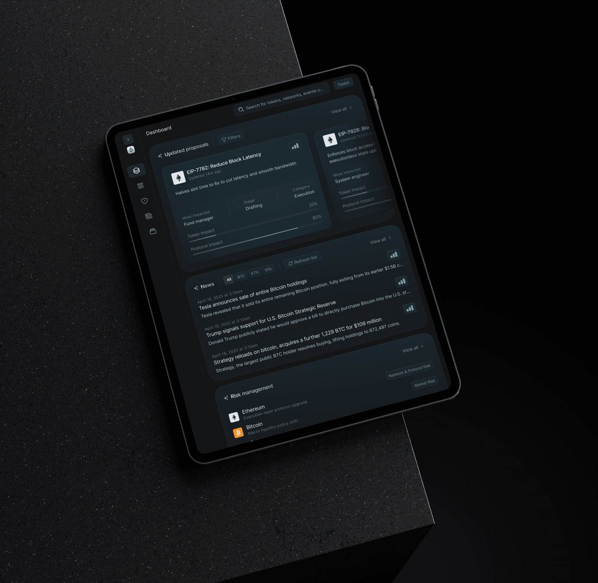
AI product · 2025
21Shares BlockSensai
Crypto governance and news intelligence for institutional teams.
Crypto intelligence for institutional teams.
View case studyView→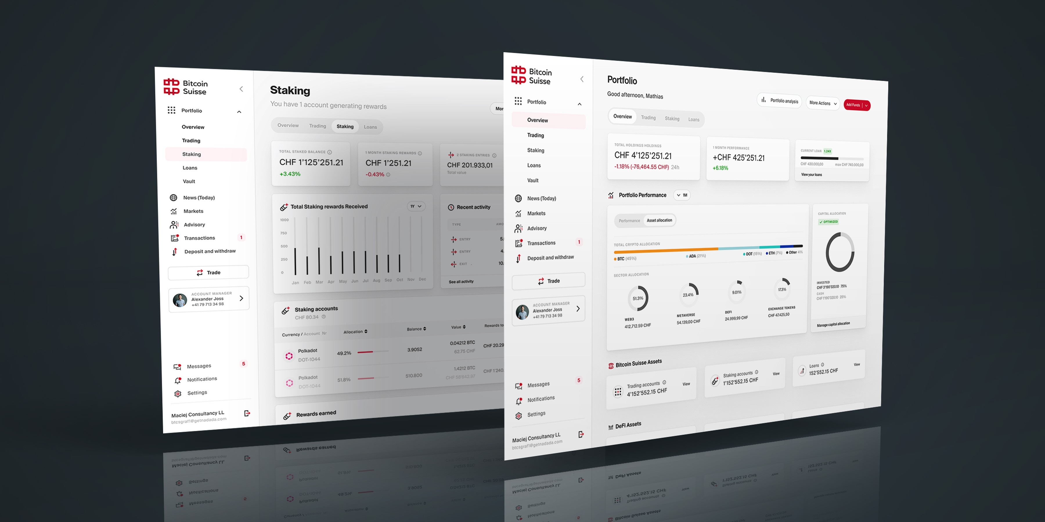
Portfolio redesign · 2023
Bitcoin Suisse
A unified model for holdings, accounts, performance and liabilities.
A unified model for holdings, accounts and performance.
View case studyView→
AI direction · 2026
Matchli
An AI-directed rental product shaped through focused exploration, critique and refinement.
An AI-directed rental product and prototype.
View case studyView→