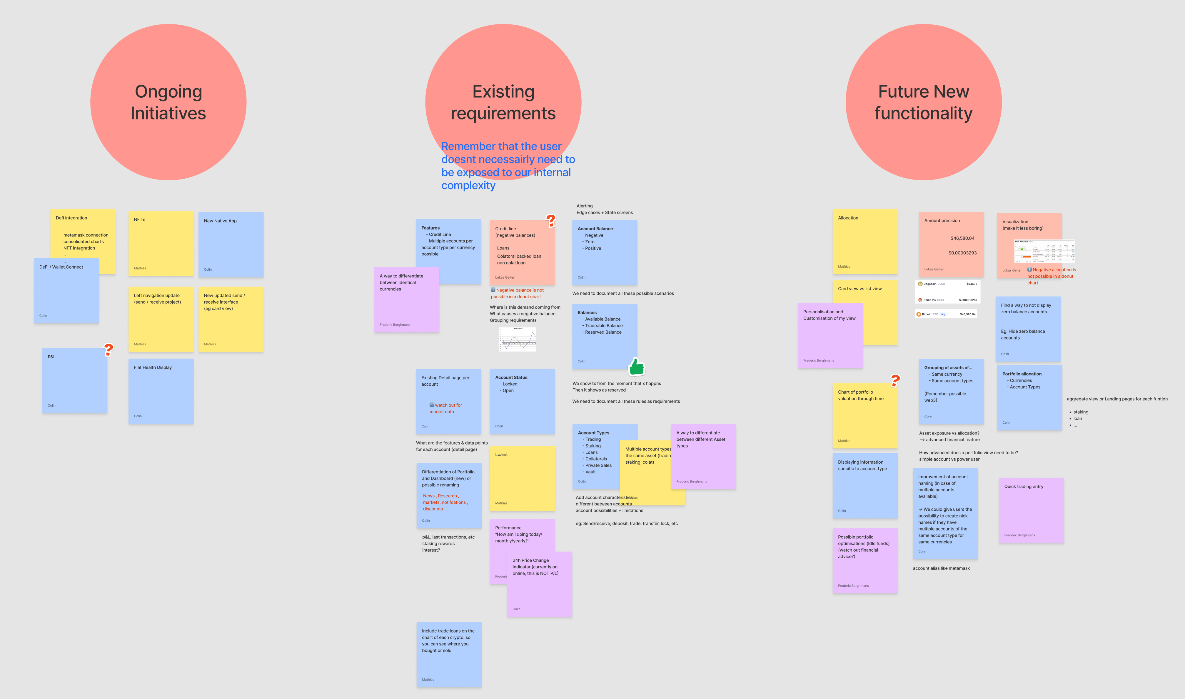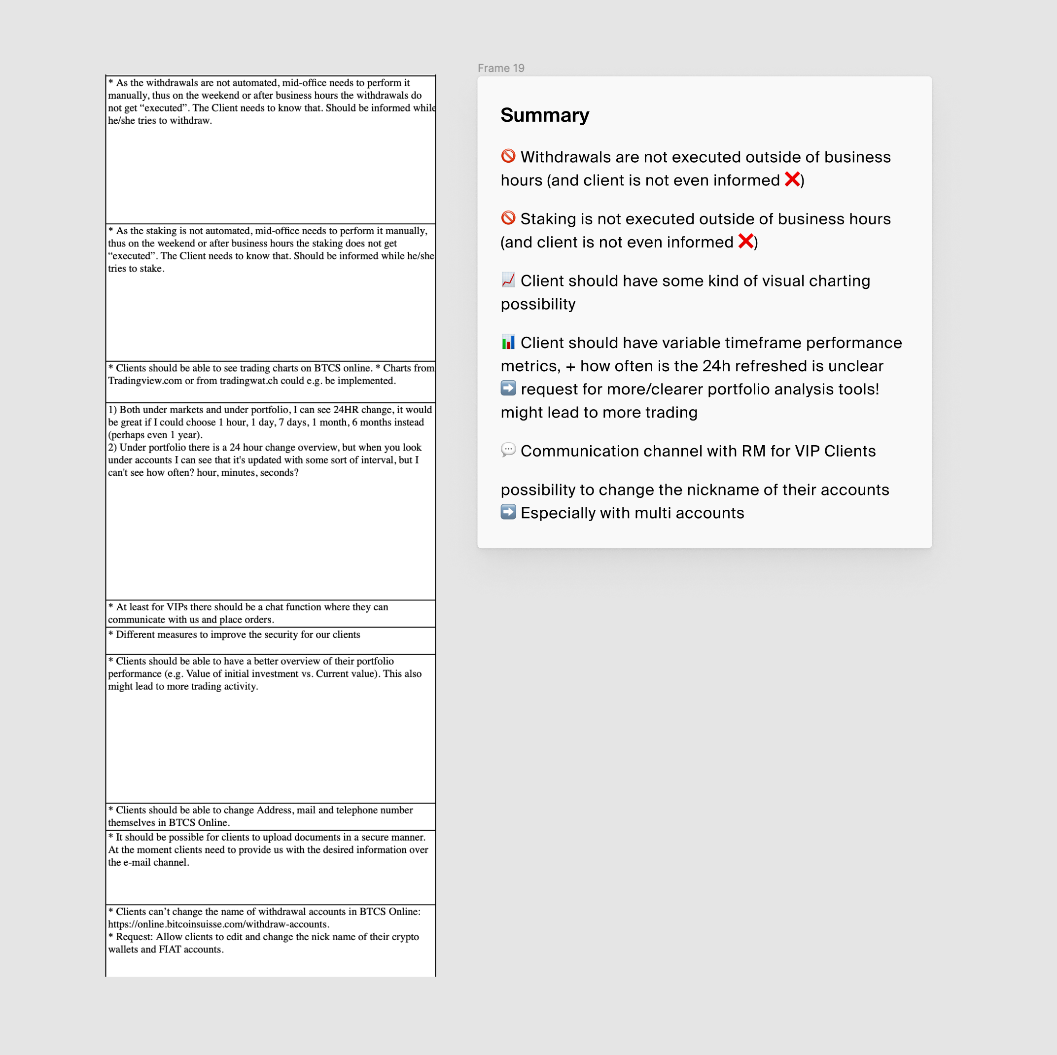
Our relationship managers shared a โfrequently asked featuresโ file that captured recurring client requests. I used it alongside client interviews to understand what people were trying to do and what they felt was missing. Their feedback helped establish the questions we needed to explore.
โ Back


A portfolio redesign that separates what clients own from what they owe, across every account.
One model for holdings, accounts, staking, vaults and loans, still live today.
In 2023, I redesigned the Bitcoin Suisse portfolio as Senior Product Designer, and ran the complete end to end UX process, working with three engineers for delivery. The main problem was holdings and accounts had been split across products, performance information was limited and the treatment of loans could make the "holdings" appear negative. I started with research and workshops, then translated the findings into the portfolio model, interface and supporting product changes.
01 / Understanding the gaps
The research combined client feedback with a survey, interviews and an analysis of the existing experience. Workshops helped us frame the problem, and I used journey maps and needs comparisons to turn the findings into portfolio requirements.
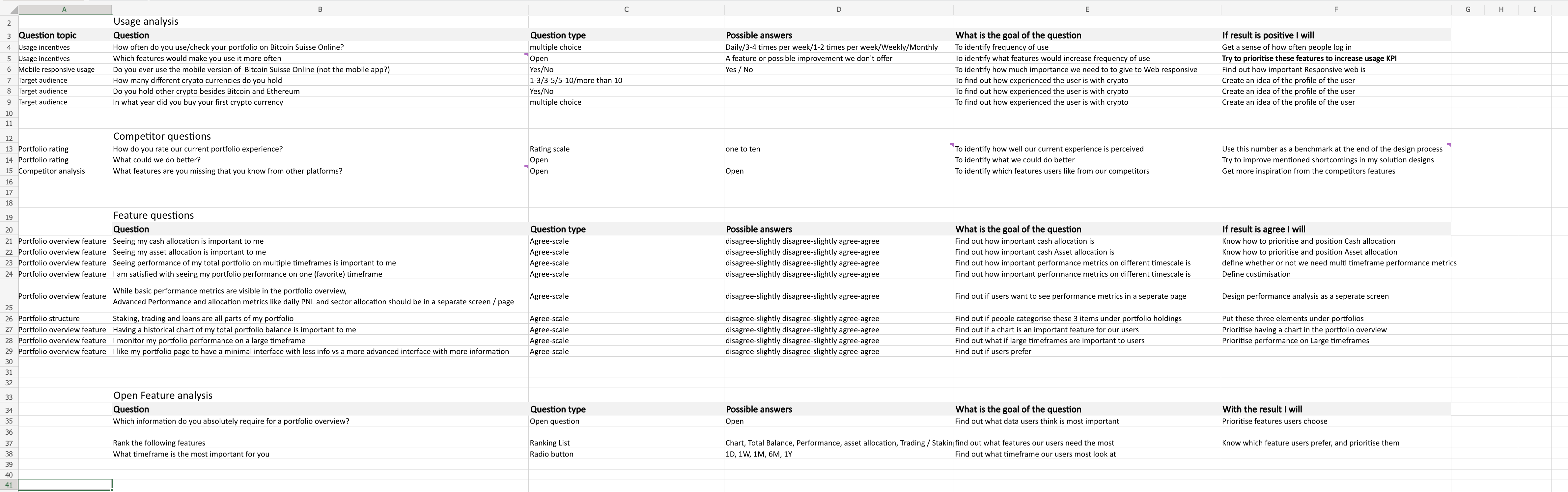
I sent a survey to more than 200 colleagues with different levels of crypto experience. For each question, I recorded the answer format, why we were asking it and what action it could inform. We asked about portfolio usage, missing information and potential features, then followed up qualitatively to understand respondentsโ experiences in more depth.
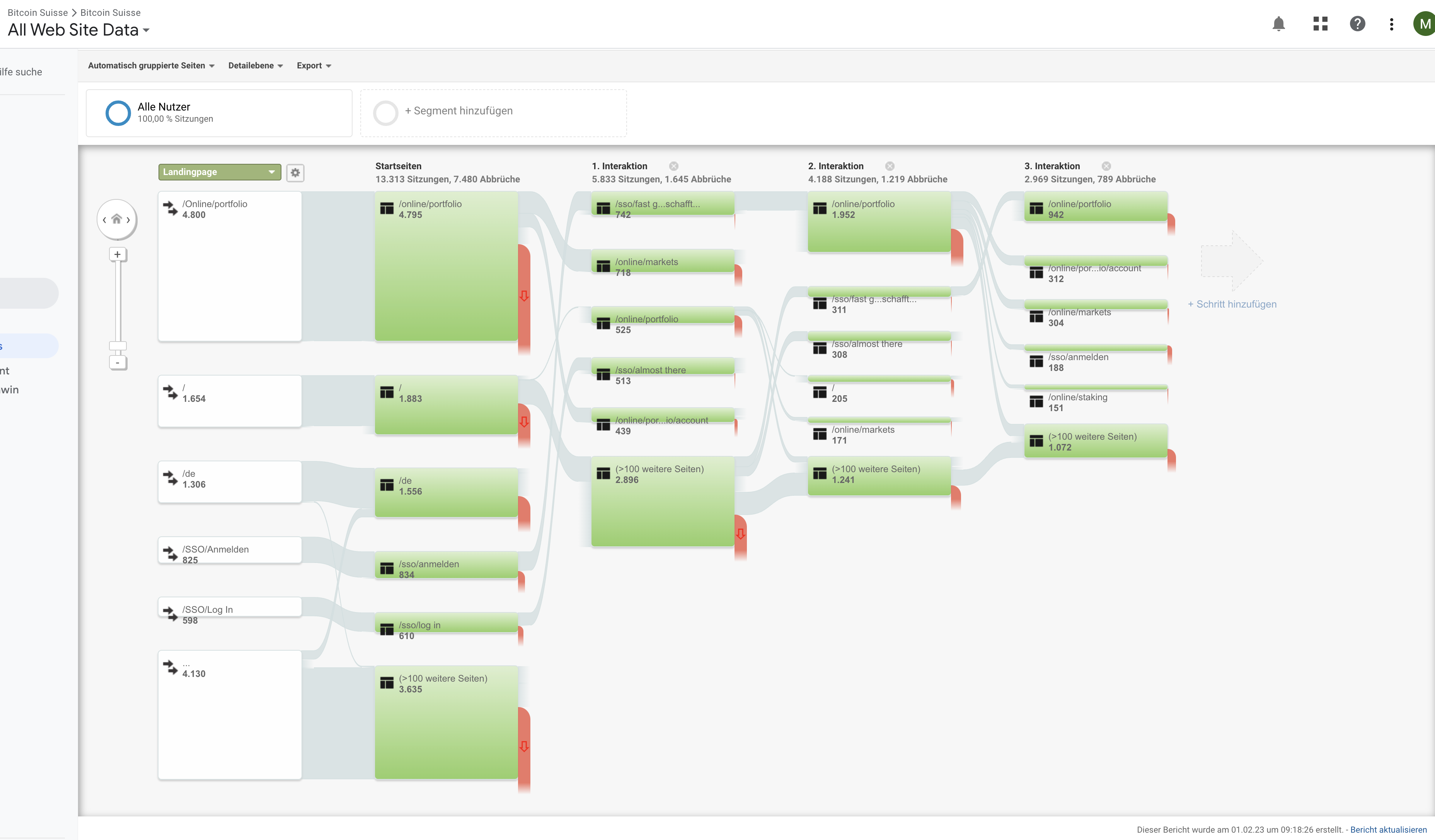
Google Analytics helped me trace how people moved through the existing experience and where they left it. Comparing those patterns with the feedback and survey responses helped us decide where to focus the redesign.
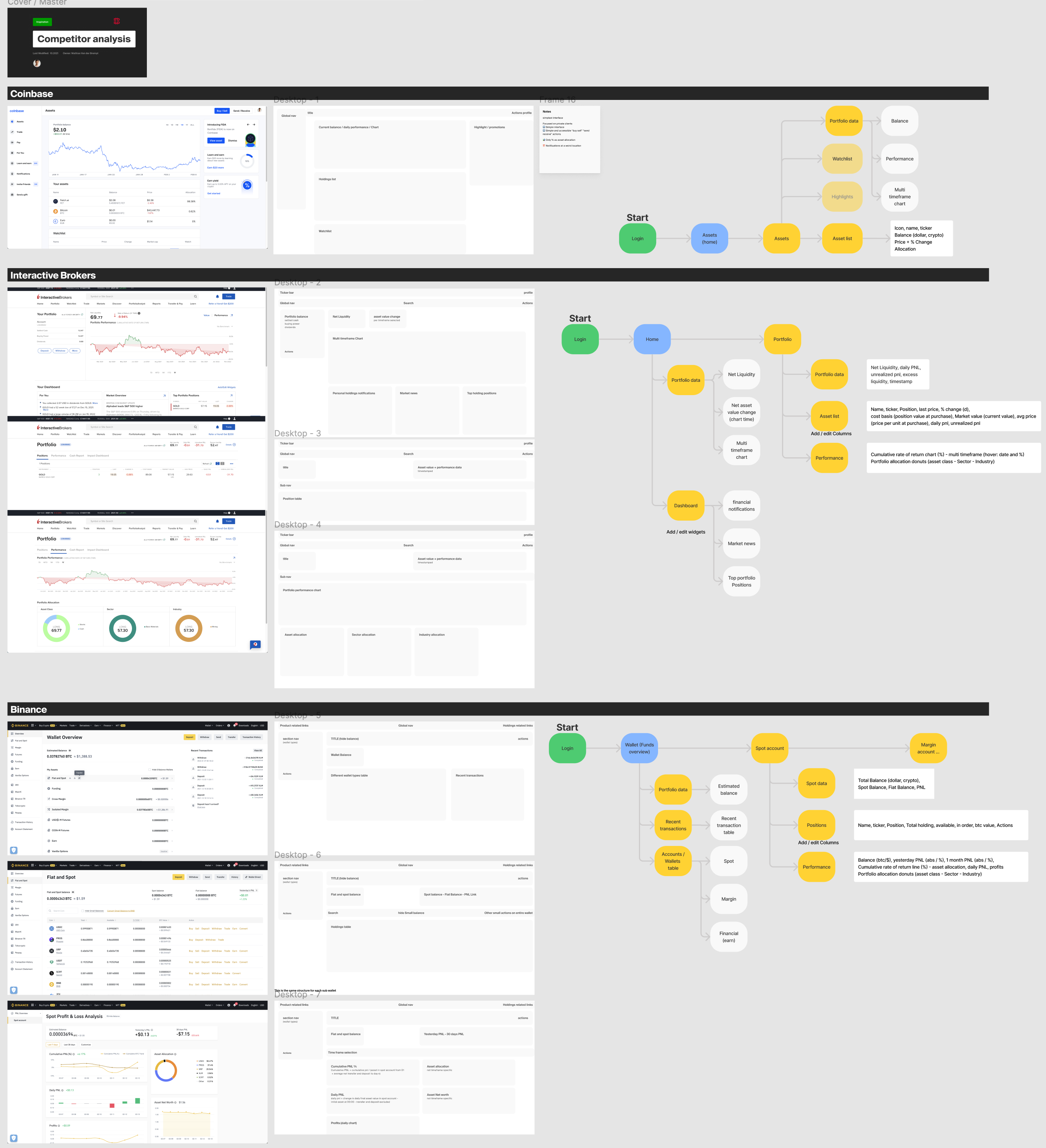
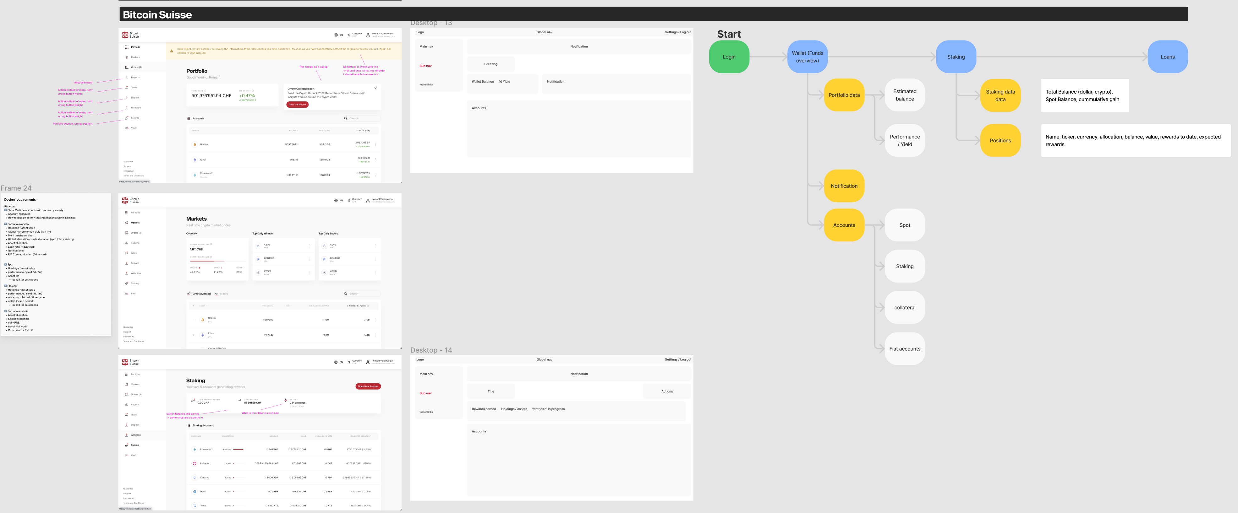
For each competitor, I collected screenshots, translated the interface into wireframes and mapped the user flow. I also compared the data points available in their portfolio views. Applying the same analysis to our own platform helped me identify structural gaps before moving into the design.
01 / Workshops and scope
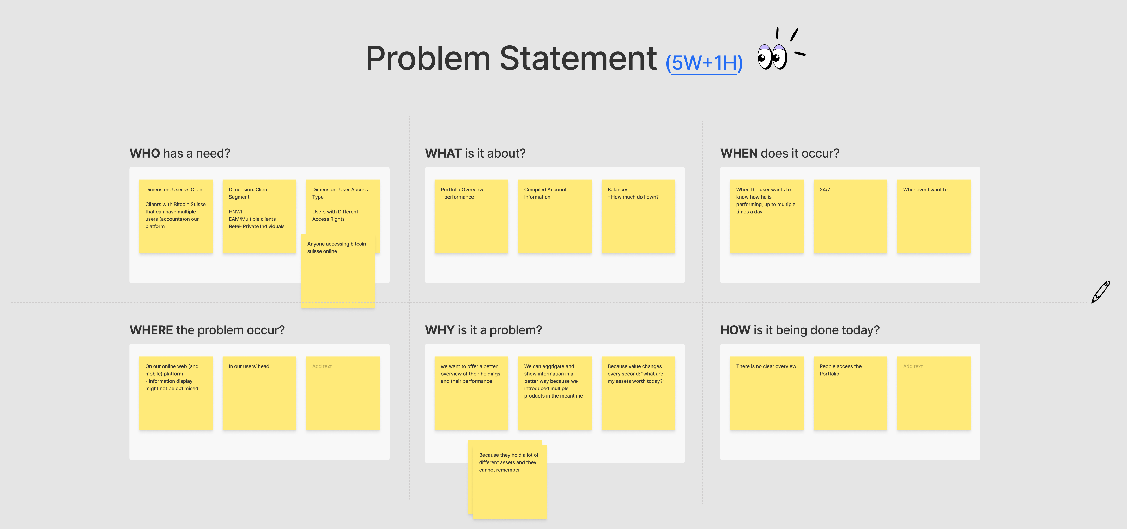
To frame the problem and clarify the scope, I organised and ran an online stakeholder workshop where we explored ideas together.
We used 5W + 1H in FigJam to describe who had the need, what was happening, when and where it occurred, why it mattered and how people handled it. Working through these questions together connected the request for a better overview with the underlying account and holdings structure.
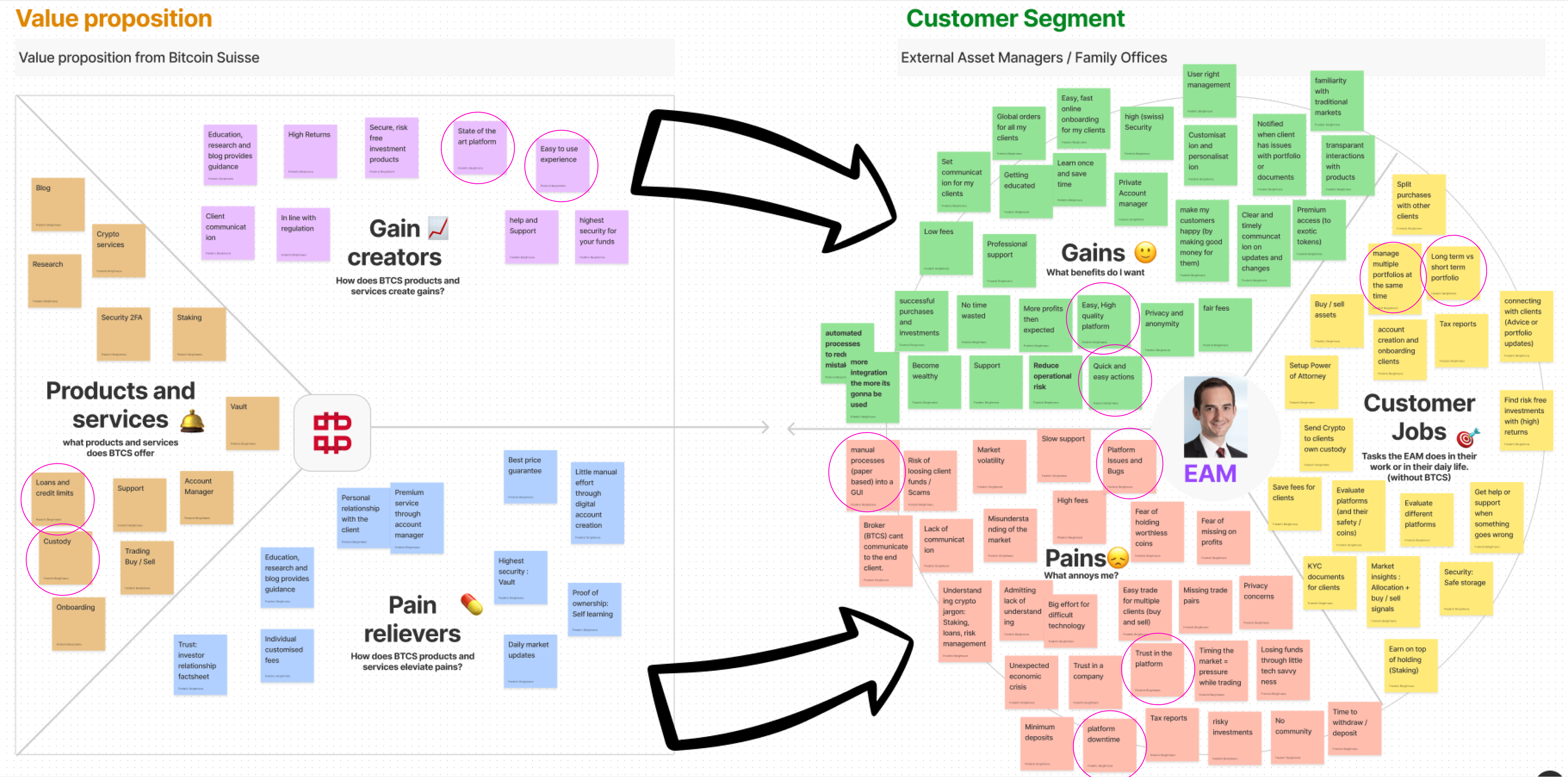
We collected and prioritised initiatives, then revisited the existing Value Proposition Canvas and marked the needs relevant to the portfolio. This helped us connect feature ideas to client needs and decide which ones belonged in the project.
01 / Synthesis and requirements
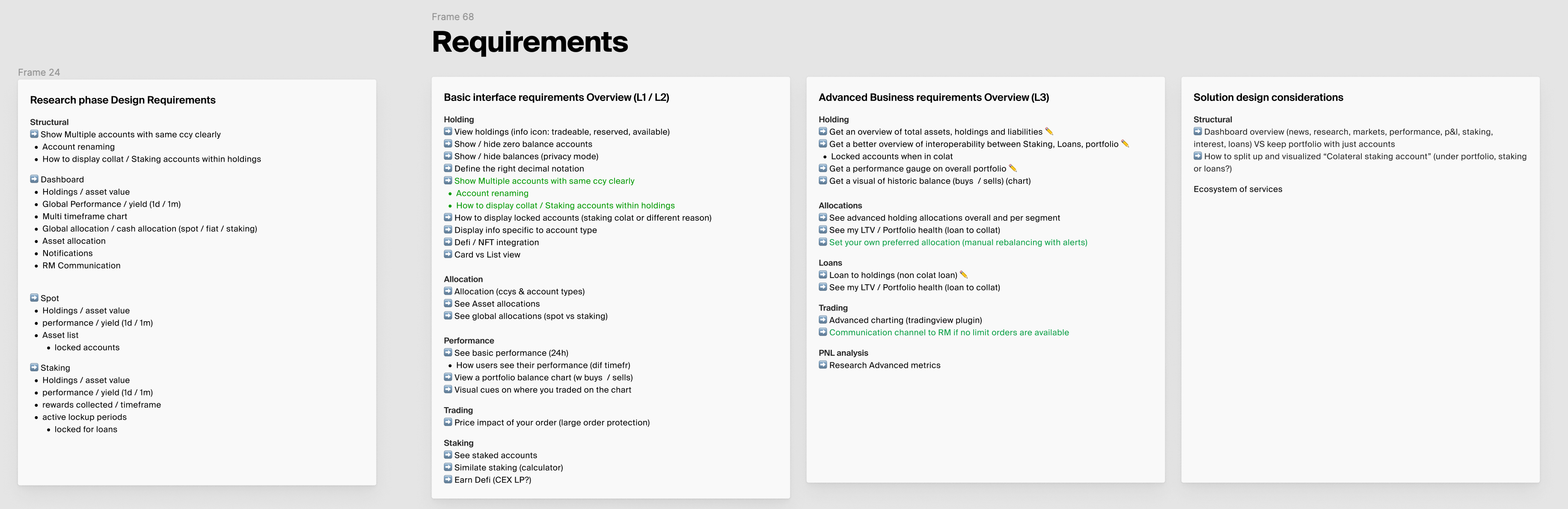
Client journeys and a comparison of needs brought the findings together. I used the overlaps to define the portfolio requirements.
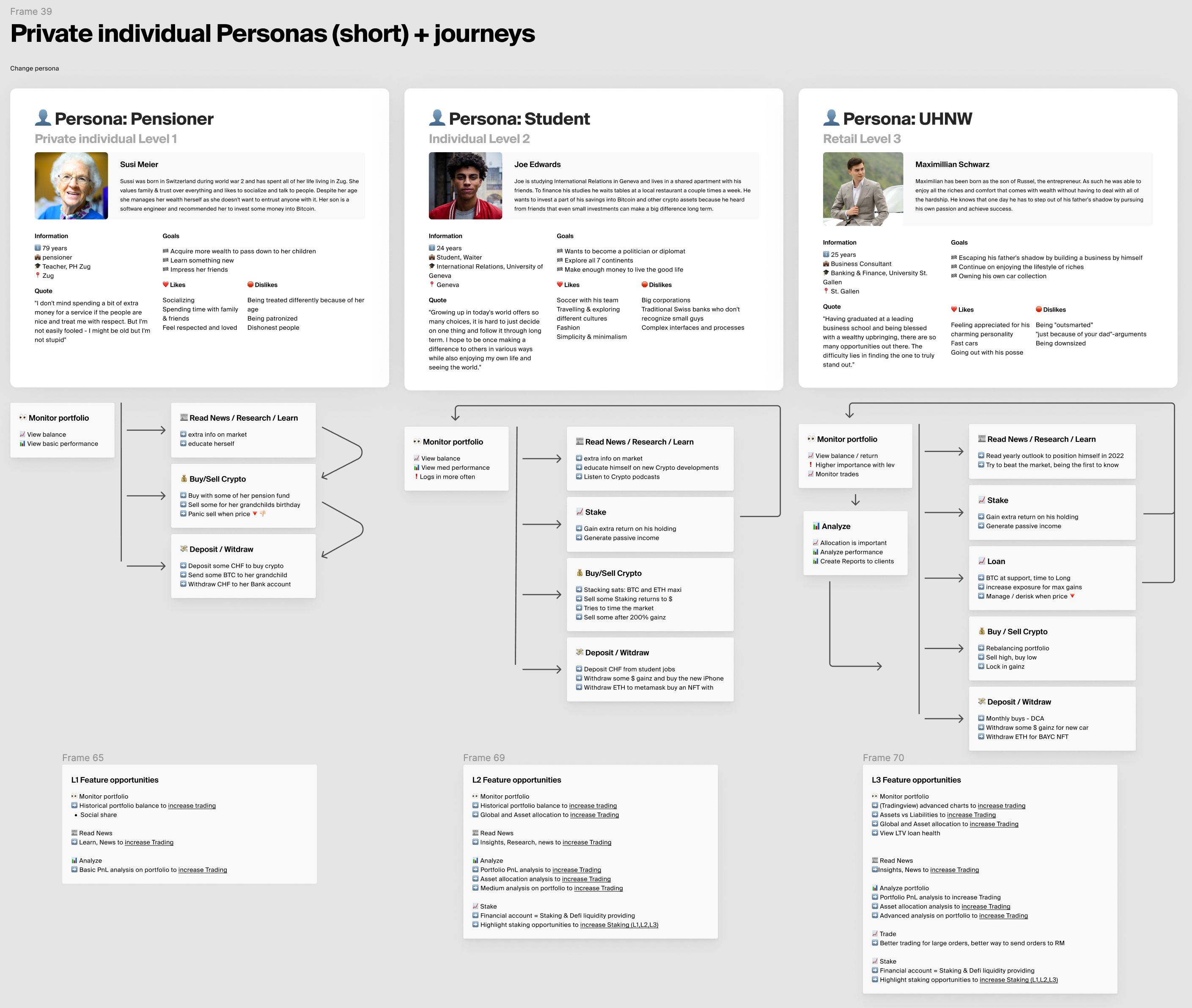
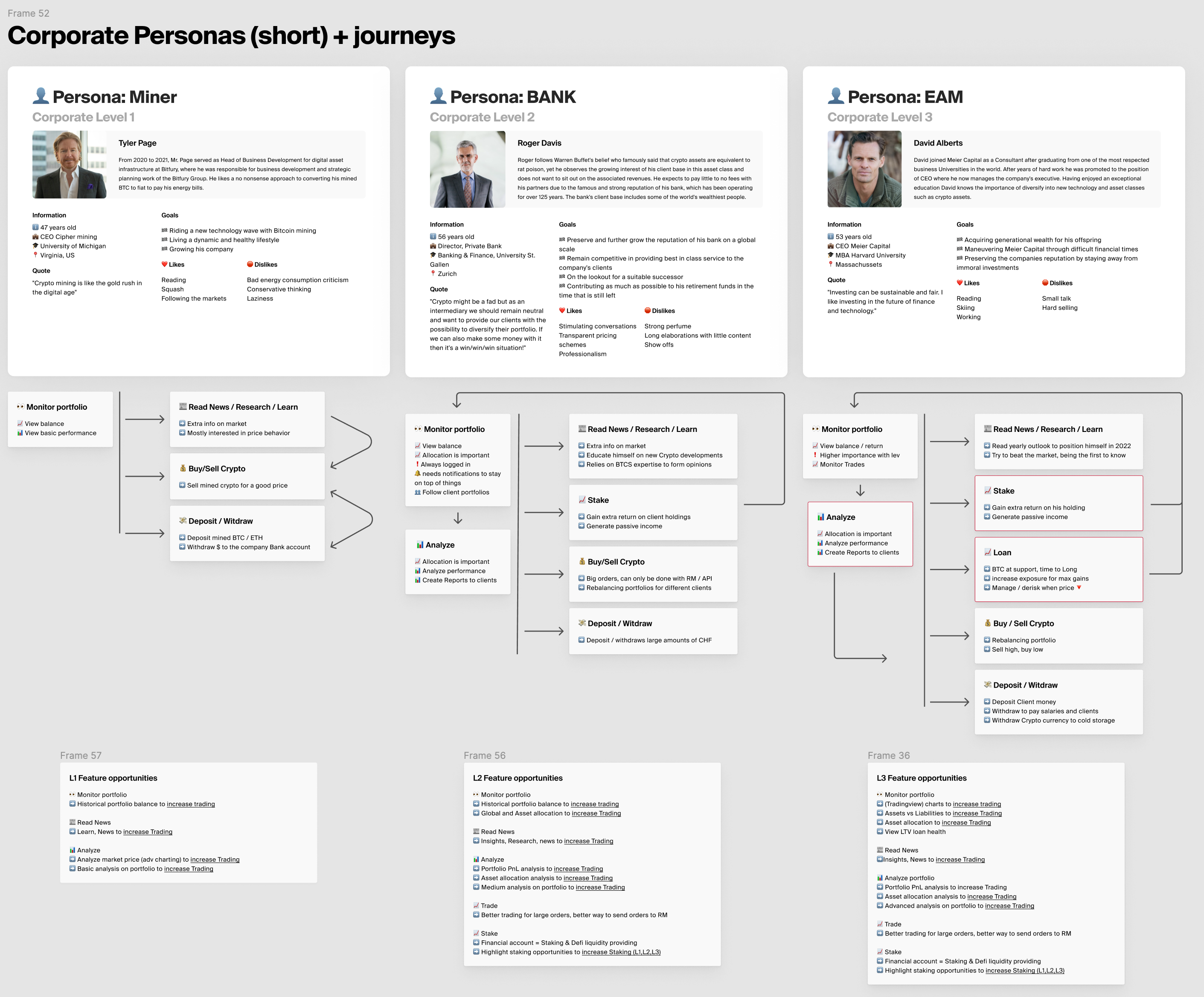
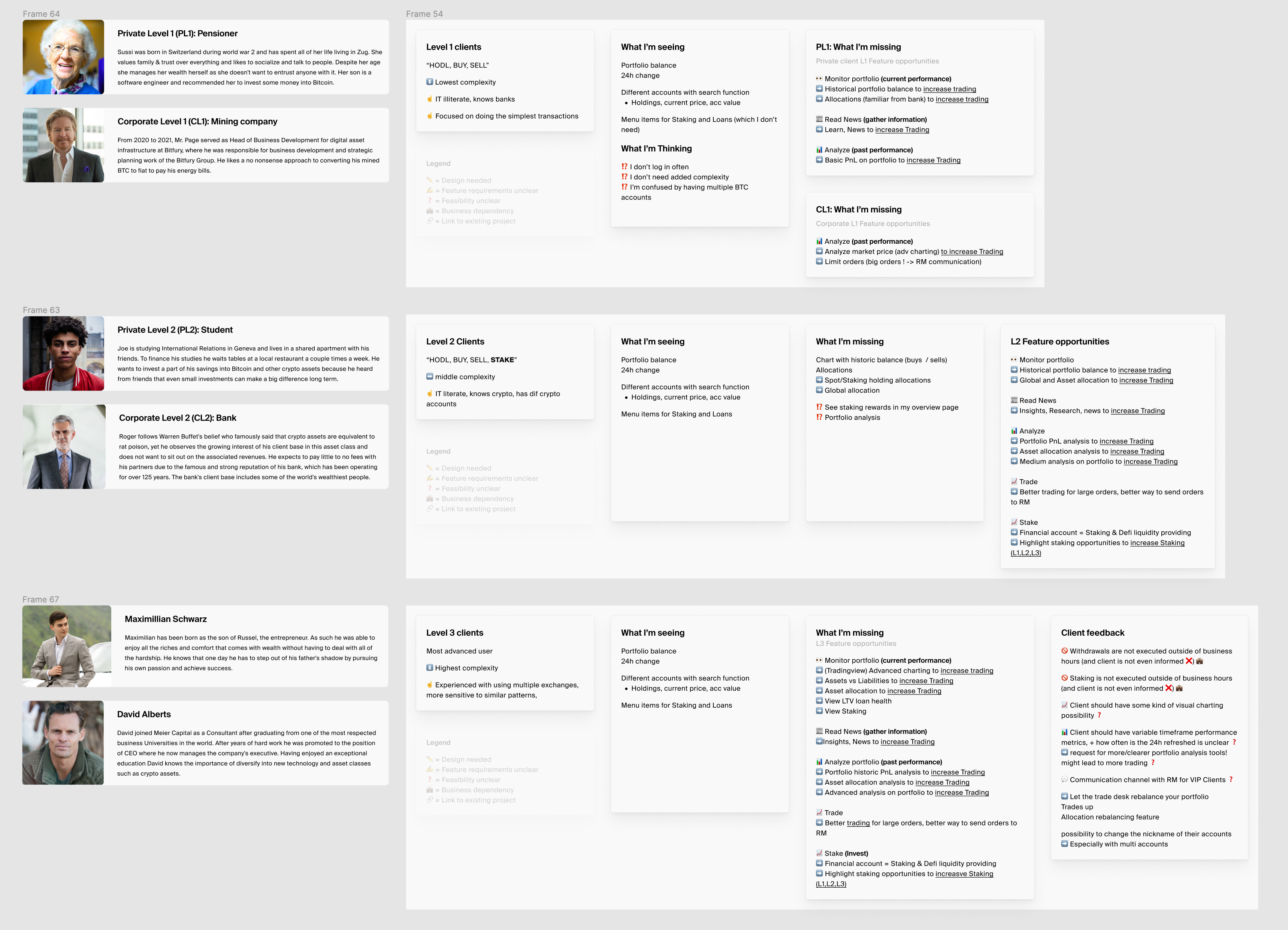
With help from our relationship managers, we mapped private and corporate clients across three levels of complexity. I created journeys for these groups and derived feature opportunities from their tasks. This let us compare clients who needed a basic overview with those who needed deeper portfolio analysis.
The comparison covered what each group had, what they thought and what they were missing. Grouping private and corporate clients by complexity revealed overlapping needs, which I translated into requirements for consolidated holdings, asset and liability treatment, account identity, readable amounts and advanced analysis.
02 / Bringing the portfolio together
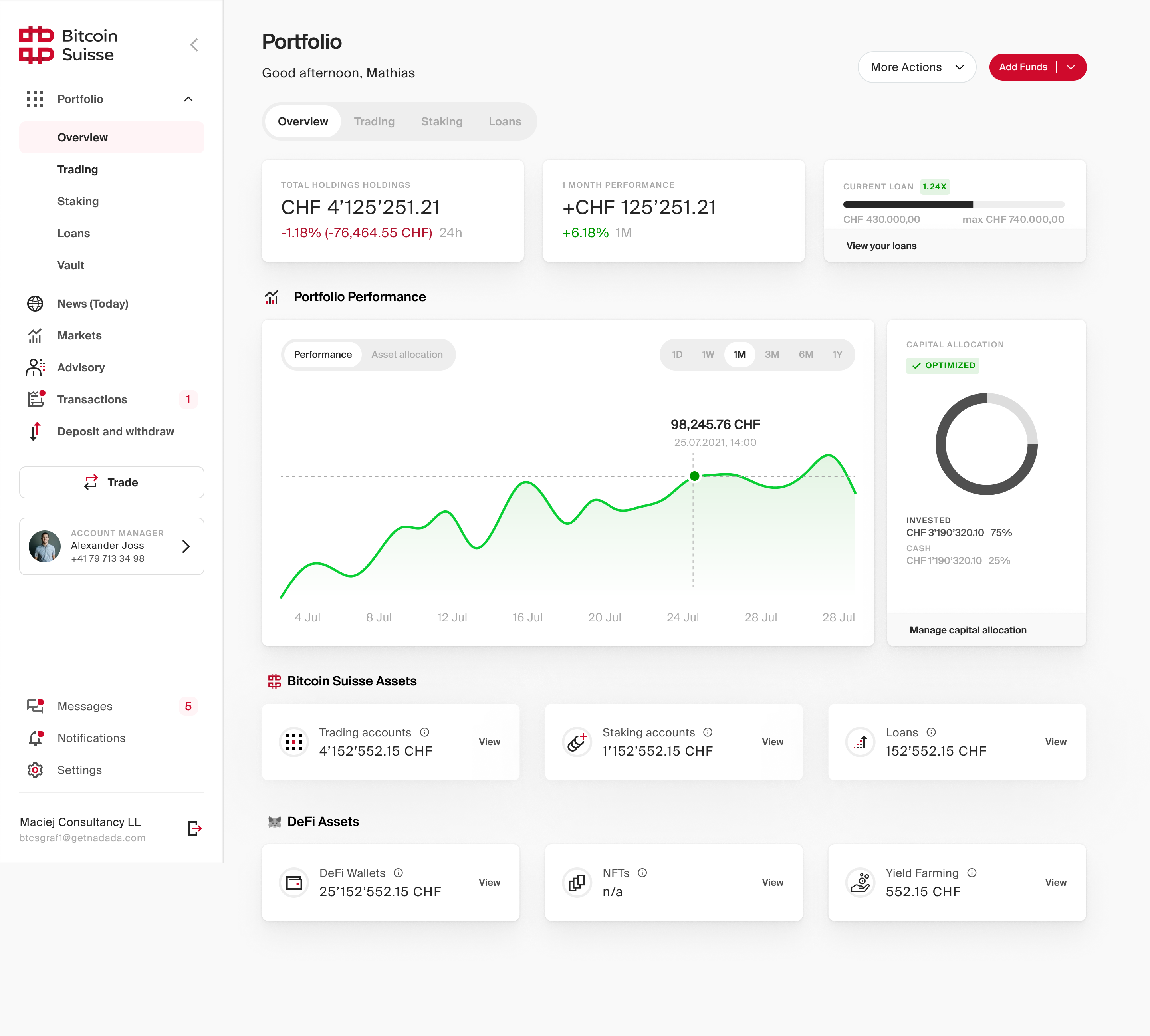
These requirements guided the overview I designed, connecting holdings, performance, allocation and account access. Assets stayed visible at their full value, while loans appeared separately as liabilities. Clients could move from an overview into the detail behind their portfolio without losing sight of either what they owned or what they owed.
I worked through the information architecture, flows and wireframes before developing the final UI. The complexity levels informed a deeper analysis view for advanced users. I revised the design with feedback from design leadership, product and engineering, carrying the same portfolio model through the screens.
03 / Making the model work across the product
Bringing the portfolio together required changes beyond the overview itself. I addressed the navigation, account identification and number formatting so the new structure could work consistently across the product.
Portfolio, staking and vaults had been treated as separate destinations. I redesigned the left navigation around consolidated holdings and presented the proposal to stakeholders. Deposit and withdrawal became part of the relevant page, while trading became an action, aligning the navigation with the portfolio structure.
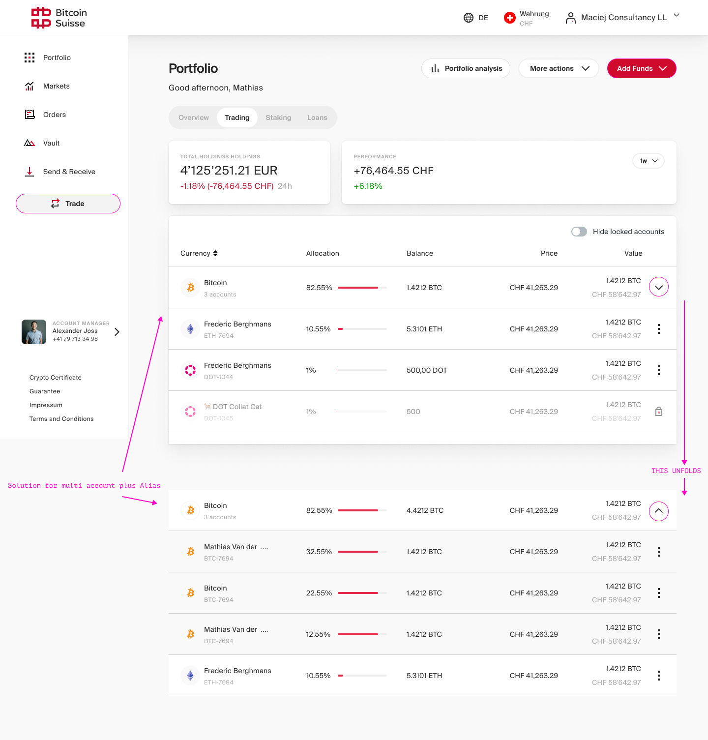
Account rows needed to adapt to the number of accounts a client held. I defined a single-account state showing its alias and account number, while multiple accounts were grouped under their currency and expanded to show individual details. This kept same-currency accounts identifiable within the consolidated view.
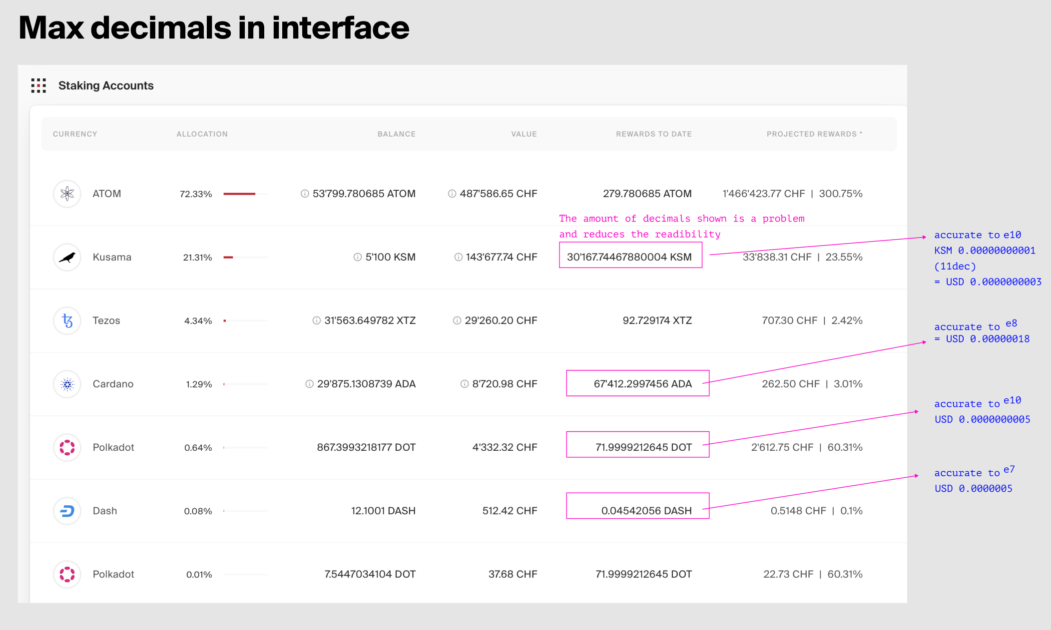
Crypto amounts needed enough precision to remain meaningful without long decimal strings. I defined the precision rules around currency value, alongside shared rules for cards, charts, lists and account rows. These helped engineering apply the same hierarchy and behaviour across the product.